
Cleanup demos
See what a clearer first impression can look like.
Concept mockups. Not a client site, not a measured result, and not a public call-out.
Desktop before and after
Before
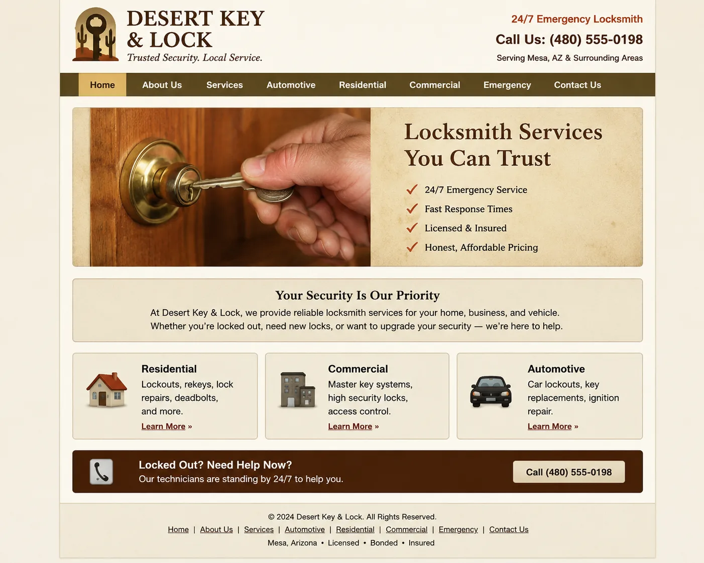
The first screen is crowded. Contact details sit low, and the reading order is hard to follow.
After
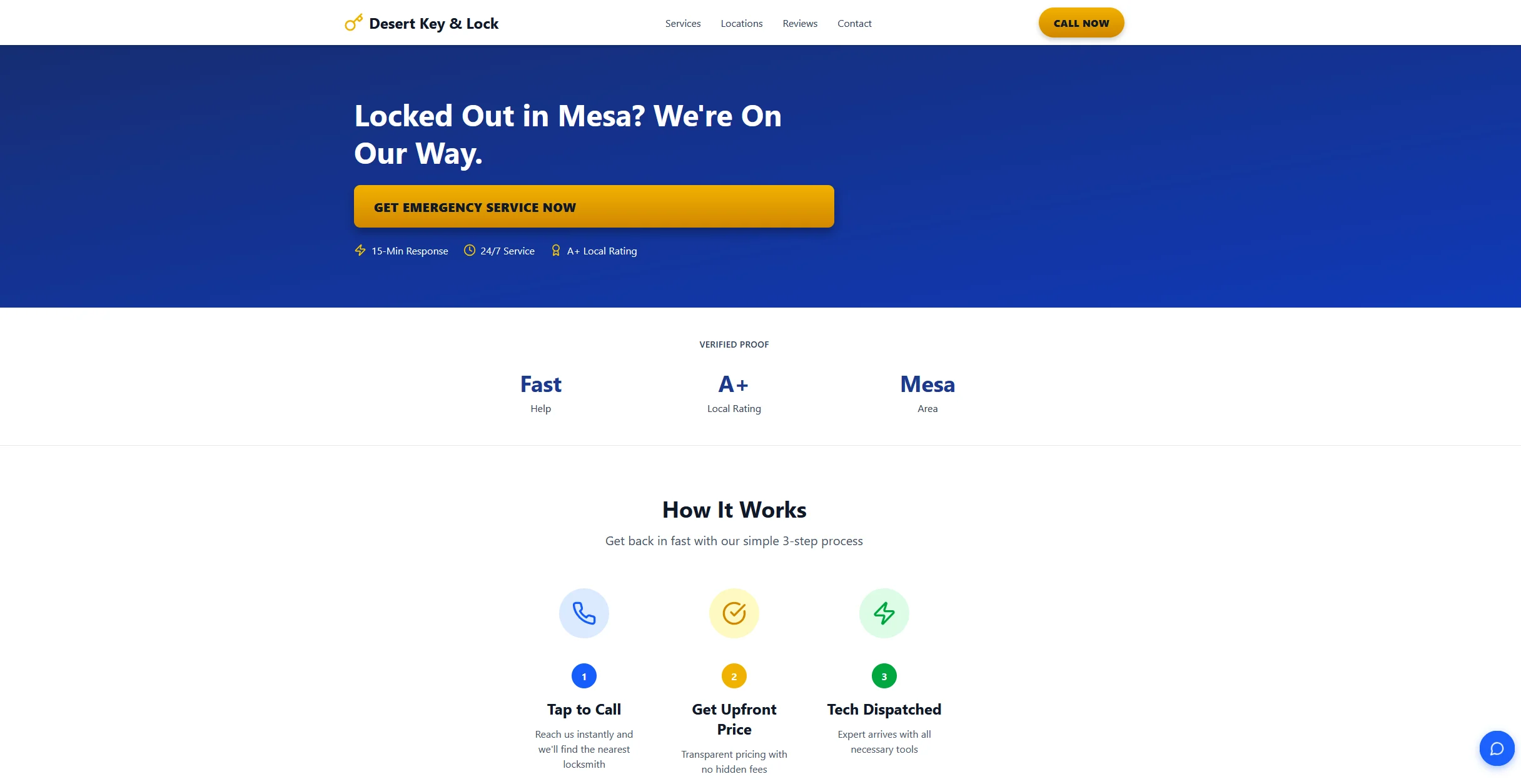
The headline says what the business does. The contact action sits near the top, with stronger type contrast.
Why. A desktop first screen should answer what this is and how to reach someone, before the rest of the page.
Mobile before and after
Before
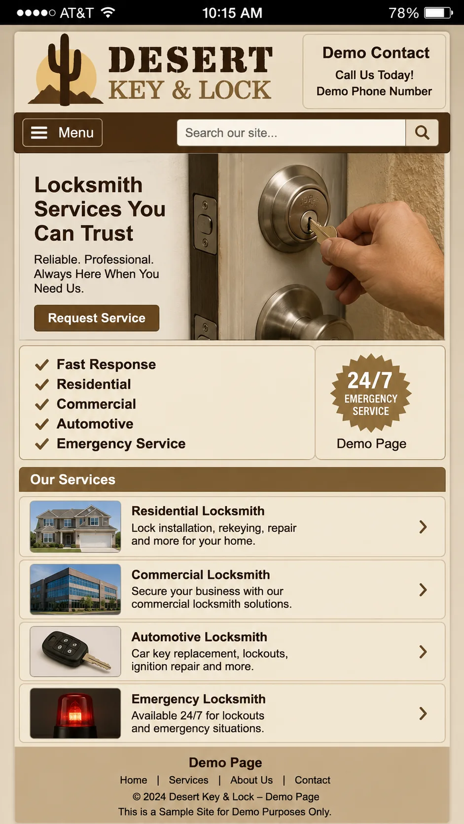
Type is small, contrast is weak, and the contact action is easy to miss.
After
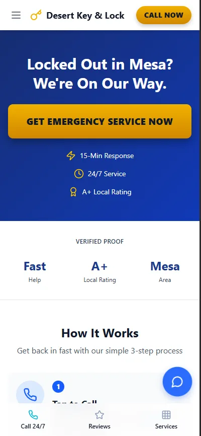
Type is larger, the action is visible without hunting, and the sections are shorter.
Why. A phone only has room for one clear next step. The rest can wait until after that.
Fictional directions
Made-up local businesses. They show a common first-screen problem. They are not clients.
Ember & Sage Mesa
Restaurant outline. A menu that is hard to open on a phone, and no obvious way to reserve.
Ironwood Build Co.
Contractor outline. Services listed without a clear quote path or project photos.
Velvet Chair Studio
Salon outline. Booking buried, services vague, and little sense of who does the work.